Happy Birthday Mekworx! Today marks the second year that Mekworx has been up and operational. Wow…sorta crazy to think that I’ve stuck around long enough to keep this place semi-updated. I’ve got to give a big BIG thanks to Wartorn again for being kind enough to give me the hosting space on Phenomer.net for these two years. Thanks so much bud, you are still the man  . Also thanks to everyone who stops by and leaves comments…even though lately that doesn’t seem to be happening much anymore. Hey if your reading this, leave a short comment! Or not, I don’t really care
I was planning on making some content updates to the site today, but that probably won’t happen as I’m a tad busy with other things. On my list of things to-do, I have some updates that need to be made to the Design page, specifically some new projects that need to be added and some updates to existing ones as well. There are also a few new Resources that I need to add including a new font that was recently released in Joshy‘s Speed of Doom megawad. I also need to write up the Graphics and Sprites page sometime…or just delete it as I’m not even sure what graphic/sprite work I’ve done is worth releasing  . I also need to update many of the links on the right side of the page as there are some new ones I would like to add and some broken ones I need to remove. I’ll also update the Info page too as I can no longer stand to look at the horrid picture of myself any longer
  . The biggest update I plan on making is a new theme, as I’ve gotten a little tired of looking at this one these days. I want something with a little more color…I’ll probably go back to blue or something like that. I doubt that it will be a purely custom theme (I might try it again) but the bottom line is that there will be a new theme and logo sometime down the road.
In Doom news, this last weekend was a really busy one for me. After nearly a year of hiatus, 32in24 returned for it’s 10th session! And actually, it’s been over a year since I was able to participate in a 32in24 since I couldn’t make it to #9, so this new session was a welcome surprise. As usual, there was a theme; this time it was a return to classic 4-8 player FFA using stock textures, which is probably my favorite theme because it’s quick and simple to work with. As the session began, it looked like interest was waning considerably as by the end of the 24 hours, there were probably only 15 or so maps. So another 24 hours were tacked on…hey, no one said the rules couldn’t be bent  . Those extra 24 hours were enough to get more people interested, and the session ended with well over 32 submissions. As I type this, there has been one testing candidate released and I imagine the second testing candidate is well on its way.
So because I have to overdo every single thing when it comes to mapping, I contributed a whopping total of 4 medium-sized DM maps of varying themes. I contributed 2 maps for the first 24 hours and then another 2 in the second 24 hours, although the 4th map was about 5 hours late. Revenant was kind enough to include that 4th map in the pack though  . Screenshots HOOOOO!


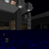
This first map I finished relatively quickly. The name of the maps is Grayscale because I used a bunch of gray textures. Awesome name, I know. Anyways, I did a bare layout with thing placements first and then detailed and textured after that. Overall I think this map took me about 4 hours to finish, minus the time I took to makes fixes and find music. I think the gameplay came out pretty good; the layout is very interconnected and interesting at least.
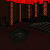
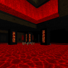

I was still feeling pretty good after finishing my first map, so I went on to draft out another layout with thing placements the following day. I came up with this layout relatively quickly as I had sorta planned it out in my noggin’ ahead of time. The detailing however…was another story. I spent close to 6 hours detailing the map. I came up with the theme quickly though; I wanted to do a hell-themed map, and it just so happens I’m working on a hell-themed map in Vela Pax at the moment. So I made what is essentially a DM version of Vela Pax MAP05’s theme. The texture palette is very similar to what’s being used in MAP05. I named the map Delirite (Del-erie-it) as a throwback to MAP05’s name, Delirium. Another awesome name….wooo I’m awesome. Anyways, I love how the map looks and the layout seems to be ok, though not as good as my first.
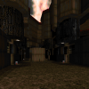
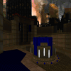
I submitted my 2nd map just in time for the 24 hour deadline. But that’s when I learned that it was going to be extended another 24 hours because of the lack of submissions. So the next day I decided that since I was able to do two maps in the first 24 hours, I could do two more for this up coming 24 hours to help and try to fill the void of maps. I spent about 4 hours drafting out 2 new layouts, but this time I didn’t bother to do the thing placements. The first layout I did turned into the map above; I named it Quinoline. This map is directly inspired by a map I detailed for the Toke It Up project, both in terms of layout and texture/detailing. I really liked the flow of that duel map and I also enjoyed the texture palette that I came up with while working on it, so I thought I’d try and emulate it in a brand new, DM map for this 32in24. I was really surprised at how well this layout turned out and I think it’s the best map I made for this particular project…and probably any DM project I’ve contributed to in recent memory. However, it came at a price; I took entirely too long detailing this map. Unfortunately I almost ran out of time, so I had to do some half-assed detailing and thing placements so I could get the map in on time. Thankfully it made it in time, but I had to go back and finish it off as I intended it and then resubmit it about 5 hours later. The whole map probably took me in the area of 10 or more hours to finish. But it was totally worth it.


esselfortium and icytux both submitted maps that were freeform and non-grid biased, so being an idea thief I decided I give it a try as well. I saved the concept for my last submission since I wasn’t sure how it would turn out. Unfortunately since I spent so much time on my 3rd submission, I didn’t get to finish this one on time. I went ahead and added things and textured it though, and I submitted it with the update to my 3rd map 5 hours later. Apparently the compilers thought it was a pretty good map because even though it was late, it made it into the final build. Anyways, the map’s name is Choco because I thought the brown ZIMMER and brown flat and brown water looked like chocolate while I was working on the layout. And also chocolate is delicious. The FIREBLU sky is…just a FIREBLU sky. Enjoy it. The layout is pretty cool considering I don’t normally do freeform work like that. I think it’s pretty fun at least. The gameplay is a little less refined a little more spammy than my first three submissions, but that sort of gameplay is fun sometimes too.
Needless to say I was burned out by the end of this session, and I haven’t touched Doom Builder since. Which is probably a good thing because I needed a break from Vela Pax MAP05 anyways…plus I had some schoolwork to do too  . I’d put an update on Vela Pax up here too, but I think I’ve spewed enough for one post. Another Vela Pax update will come soon enough.
At any rate, thanks again to all of my readers and visitors! And thanks too everyone who takes the time to play through my work too! And double thanks to Wartorn for being completely awesome! Hopefully the site and I will still be around for the next birthday ![:]](https://mekworx.the-powerhouse.net/wp-includes/images/smilies/emot-smile.gif)
