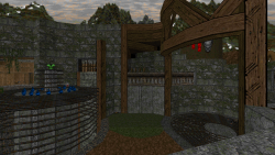
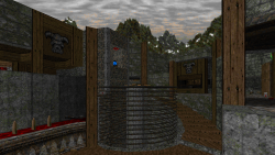
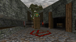
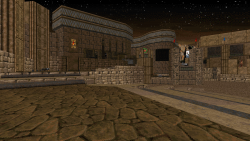
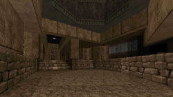
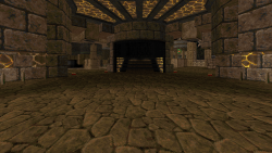
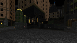
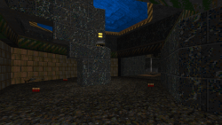
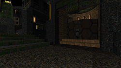
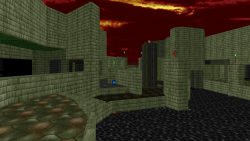
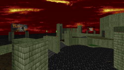
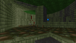
Screenshots:
Information:
- Project Name: 32in24-15: Dwango Unchained
- Game: Doom II
- Engine Needed: Boom Compatible
- Game Type: Deathmatch
- # of Maps: 54
- # Contributed: 4
- Status: Released
- Release Date: 01/23/16
Description:
32in24-15: Dwano Unchained is the 15th installment of the 32in24 series. This session’s theme was to create deathmatch maps using some sort of movie theme (even if just in name). Additionally we were directed to create silly movie posters which would then be turned into textures and used throughout each of the maps. Like many of the previous installments before it, we were given 24 hours to make the initial maps, and then time in the preceding week to make bug fixes and changes based on feedback.
I contributed a total of 4 maps, 3 of which I heavily detailed. I ran out of time on my 4th submission for detailing, so I did some “speed” detailing and gave the map some simple lighting and clean mono-texturing.
No Country for Old Space Marines (MAP20) was my first submission. It’s a relatively compact map with silly raising/lowering floor gimmicks. It might be a decent duel map in addition to it being ok for 8 players. I had the idea for a map using raising/lowering floors before the 32in24 session started, and I decided to give it a go to see how it worked. On the whole it works out ok; being a gimmick, its hard to say if its objectively good or not, but I like it. The map actually use to be double the size it is now. While making updates after getting some feedback, I felt that the map was actually too big for the weapon/item placements I had made for it. So I shrunk the whole thing down by 50% and made some adjustments to make the spaces playable. The larger map could have worked well too, but the weapon placements would have been changed around (there would have been more higher-tier weapons throughout the map along with SSG starts). I ended up detailing the map with a Mayan ruin theme.
Bravefart (MAP10) was my second submission. This map has kind of a weird and obscure origin which I didn’t detail to anyone. It started out as a very rough approximation to a practice map I made years ago for Carnevil’s Wrack (back then it was called “Project Vega”); fun little factoid – the map was directly inspired by a restaurant near where I live. That layout was finished but never used for anything. While trying to brainstorm layout ideas for my 2nd submission, I decided to try and do something similar, but in the Doom engine. I gave my idea a try, but it ended up being heavily altered by the time I finished. What I ended up with was something that doesn’t resemble the old Project Vega layout much at all, but still something I really like. This map have some nice height variation, but its spread out so the spaces aren’t as congested. I went with a Egyptian theme when detailing this one, and I think it looks the best out of all of the maps I submitted for this session.
Dial ‘F’ for Frag (MAP01) was my third submission to the project. This map started out as just some random layout that I pieced together really quickly. I attempted to do some sort of chokepoints between two arenas which were then wrapped up in some outer ledges and some raised pathways. The chokepoints don’t really play much of a role in the map because the upper pathways allow players to circumvent them, so that gimmick didn’t pan out all that well. Overall though, I think this one came out decent enough from a gameplay perspective. Visually I decided to try out a cityscape theme after seeing something similar being done in another submission. The visuals came out really awesome, I think, particularly with the tall skyscrapers and general city feeling.
BFG to the Future (MAP33) was my fourth and final submission. Out of all the layouts I made, this one is my favorite. And ironically the great layout is somewhat squandered with the crazy weapon/item placements I had plans for it before I even finished the layout. The idea from the start was to create a power weapon heavy map with specific focus on BFGs. I then concocted a silly word play on my favorite childhood movie “Back to the Future“, and thus this map was born. Even with the slightly crazy and thoughtless item placements, this map might be my favorite of the bunch from a gameplay perspective. The layout would be pretty good with a more normalized weapon and item spread too. I ran out of time for detailing, and I was pretty exhausted by this point, so I ended up just doing some clean mono-texturing along with some simple lighting to round this one off. This map will likely be recycled into a future project with proper detailing and item/weapon placements.
I also contributed 3 dumb movie posters to the project – “The Satan Claws“, “Cyberzilla vs. Mechacyberzilla“, and “BFG to the Future“.

