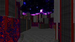
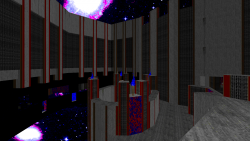
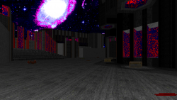
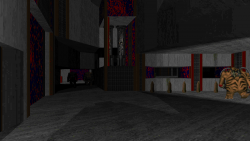
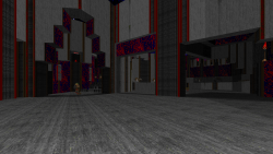
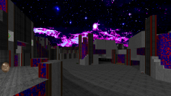
Screenshots:
Information:
- Project Name: 50 Shades of Graytall
- Game: Doom II
- Engine Needed: Boom Compatible
- Game Type: Singleplayer/COOP
- # of Maps: 18
- # Contributed: 1
- Status: Released
- Release Date: 09/09/2015
Description:
50 Shades of Graytall is one part mapping exercise and another part joke project. The project started when Doom community member Gez proposed (jokingly, I presume) the following:
You should only use three textures: DOORTRAK, GRAYTALL and FIREBLU1.
As for flats, F_SKY1 everywhere.
Another community member, Marcaek, decided to run with the idea, and thus 50 Shades of Graytall was born. As a tweak to Gez’s initial rules, Marcaek allowed the use of 1 extra flat of our choosing, as well as custom sky textures and the use of MBF sky transfer specials.
When I first saw the concept, I thought it was a neat idea, albeit a silly one. I had considered making a map, but it wasn’t until Marcaek approached me personally that I committed to making something for the project.
I started one bare layout not to long after that, but eventually ditched it because it was becoming too large. Ditching this layout probably killed a few weeks worth of work, which was more than I wanted to put into for a contribution. But I started on another layout, with the initial intention of making something short and action packed. However in a turn of events that surprised no one, I ended up making a very large, non-linear concrete maze. Even though the map came out larger than I wanted, the flow and some of the architecture and lighting I produced looked pretty cool.
The map is called Big Dwayne’s Orbital Concrete and Propane Emporium, and it occupies the MAP10 slot. In addition to the map, I made a blue and purple space sky texture to go along with it. I focused heavily on making interesting architecture and lighting in order to cushion the fact that I could only work with a pool of 3 subpar textures (except for FIREBLU, which is the pinnacle of the Doom texture pool). There are a couple neat lighting effects I pulled off, including a special light fading effect in one of the map’s early trap rooms. The gameplay is my usual slow difficult progression, but I did try to keep the map interesting with lots of dynamic architecture and traps. The last arena before the exit in particular has lots of lowering and raising floors to help create a sort of shape shifting area.
The map took me much, much longer to complete than I had originally planned. I probably spent a couple of months from start to finish, with the detailing and lighting being the most tedious step by far. The map almost tripled in sidedef count after I finished detailing, thanks to my obsessive texture alignments with the odd GRAYTALL texture. The gameplay didn’t take nearly as long to implement, thankfully.
The map set won a 2015 Cacoward, so that’s cool!
As a bonus, here is a silly set of FIREBLU keycard sprites that I made, with credit going to Obsidian for the blue keycard and the idea 


