It’s that time of the year again I guess. For some reason, I forget about this place until around October of the given year, when I get the itch to go through and update the site. Honestly though, this year is been pretty uneventful for me in regards to Doom projects. So I haven’t felt the need to make updates here (even though there were some loose ends from last year’s update that I needed to take care of). Funnily enough I made many of the site updates in September, and I told myself I was going to get this blog post out before October. You can see how well that worked out 
So I’ll get the boring stuff out of the way first. October is the site’s birth month, and this marks its 11th year of existence! I have to thank Wartorn for being so generous with the webspace and for helping me with back-end issues. The site is running the latest WordPress release (5.2.3) and I’ve updated all of the plugins and the current running theme. Speaking of the theme, there’s now a proper matching download button image (see the bottom of any project release page), and I went through the header background images and attempted to make their file sizes smaller by cropping them and converting them to jpg. Hopefully its a little less annoying to load a page now.
The following project pages are new or have been updated: Eviternity, 32in24-17, and Mek’s Box ‘O Skies. Some of you might be wondering why the Supplice page goes to a facepalm. Well the old page still exists, but I haven’t figured out the best way to update it. The project is so huge and there’s a ton of content that I’d need to post on there. Updating it will be a project in itself. Maybe I’ll get to it one day.
I also spent the time adding a bunch of new, totally useless emots like this one –  …and this one –
  . Why? Well actually, these were made for use on the private Project Retrograde dev-forum. I had intended to upload them here waaaay back when I first made them, but it seemed like they would be kinda useless. Now that the project forums are pretty much dead, I thought I may as well dump them here. Oh and if you’re wondering about Project Retrograde…well, I think I mentioned this in an older post, but its on indefinite hiatus due to various reasons. It’s something that I want to continue working on in the future, but right now I just can’t work on it in any meaningful capacity.
Now on to the good stuff! Like I mentioned earlier, this has been an uneventful year for me in regards to mapping (so far). On a personal level, I’ve had to deal with some health issues that have really eroded away my motivation (I won’t go into specifics, but it’s nothing serious). On top of that, I’ve been working on finishing up my I.T. degree. So as is usual for the average person, I’ve just had “real life” things slowing me down. But even with all of that, I did manage to work on some projects. Actually in hindsight, even though I haven’t done a ton of mapping recently, I do have a lot of content to show off.
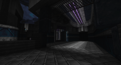
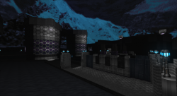
Supplice has been moving slowly this year; Cage was busy finishing up Ion Fury (which you should absolutely go and buy!) and that has slowed down things considerably. The other team members have all been working on their own projects as well. I did manage to get some planning and mapping done though. So I’ll start with the 2nd Supplice campaign map named Cryoferron. This is likely old news for some of you because I finished this map back in September 2018. Now why didn’t I mention this in the previous post? Well because I had plans to make a new blog post shortly after that one…yea  . But oh well, that just means more content for this post!
This ended up being another fairly large map (DB shot), and it actually shares a relationship with Romeda (the previous campaign map I finished). Both were layouts I made years ago for a small Doom 64EX project I was tinkering with. Cryoferron is the larger of the 2 and it was a lot of work to get it in this partially finished state. This is an episode 2 map that takes place on the frozen moon of Triton. The setting will emphasize high-tech bases in dark, icy environments. I haven’t made a gameplay pass on this [or Romeda] yet, and there’s still some visual refinement that I would like to do. Overall though, I was very happy with how this turned out visually.
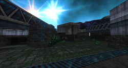
Shooting forward to earlier this year, I started work on some Supplice DM maps. At this point I knew things were going to slow down, so I decided it would be a good idea to get some texture practice in. From March through June, I made 4 DM maps of varying themes. I’ll start off with Helafex Station.
This was a practice in the E1 earth-like setting (on an Earth-like planet called Methuselah, same setting as Romeda). This is a small and mostly flat map that I chose as something that would allow me to do detailing quickly. You’ll notice some greenhouses in one of the screenshots; that’s something we wanted to try out for this setting and I think they’ll look pretty cool when done in a more serious manner (currently they don’t have ceilings since that’s difficult to pull off in Boom). The idea for this setting is to have the player traverse the living and working quarters of the terraformers who settled here. I’m hoping we can put an emphasis on lots of earth-like natural settings as well (trees, grass, caves, etc).
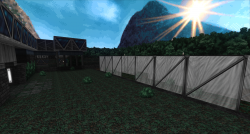
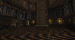
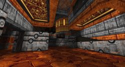
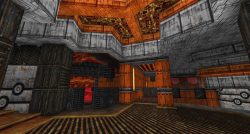
Shortly after I finished Helafex Station, I started work on more serious effort, this time utilizing the newer industrial textures that Cage had been working on. The layout for this map was specifically made for the industrial theme (being inspired by some Quake maps). This one is called Dynahammer.
I ended up being super happy with how this one turned out; the end result was very close to what I had envisioned when I drafted the layout. The big thing I want to focus on with the industrial setting is large and opposing architecture. The setting takes place on the tiny moon Daphnis, which has a desert-like environment spotted with huge mills and factories. More hellish influences will start popping up in this setting as well. I put lots of emphasis on height variation in this one; it has a bowl structure with raised walkways encircling the center of the map.
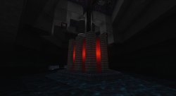
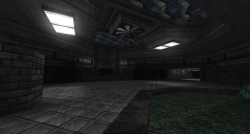
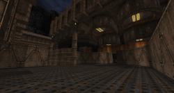
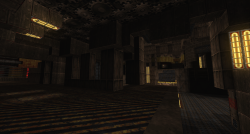
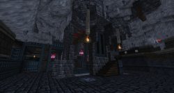
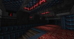
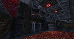
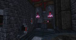
After finishing up Dynahammer, I took a short break and then began work on the conversion of an existing 32in24 map (specifically Marmalade Murder Mansion from 32in24-13). This was a map that I felt came out pretty decent in its original form, so I made plans to convert it. I wanted to convert it much earlier, but I didn’t really have an idea for it until I remembered that I needed to try out a hellish Triton-style ice theme. So that’s what I did, and thus Demonic Cryonics was born.
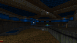
The layout needed some changes, but most of the gimmicks from the original were left intact. Visually it came out looking pretty neat I think; instead of having the building be out in the open, I decided to put it underground in a big ice cavern. The Triton theme will have some hellish elements to explore, and I was planning on keeping most of them underground similar to this map. I wasn’t sure if the blue+red color scheme would work out, but it looks really nice, especially with Cage’s awesome version of FIREBLU.
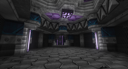
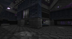
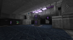
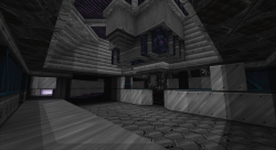
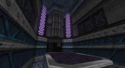
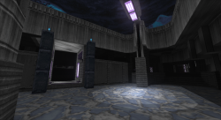
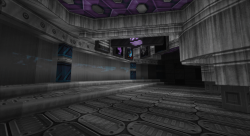
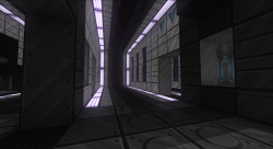
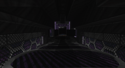
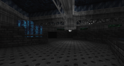
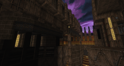
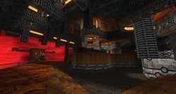
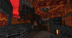
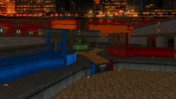
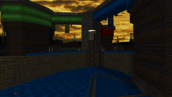
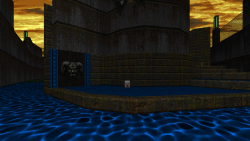
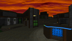
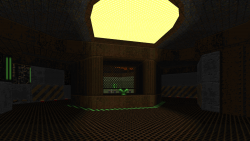
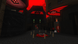
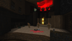
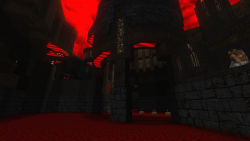
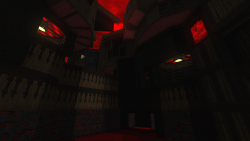
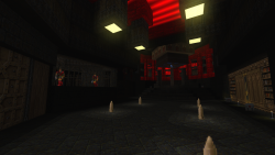
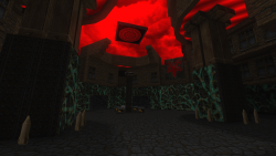
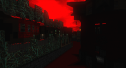
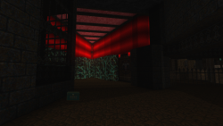
The final map to round off the Supplice update was one that I really struggled with. After Demonic Cryonics, I actually wanted to start my 3rd campaign map. It was going to be for the decrepit floating techbase setting (on a gas giant called Bellerophon). But this was around the time I started hitting some roadblocks, and I just couldn’t wrap my head around a good concept. So I decided to revisit a DM layout that I had started a few months prior. After struggling to finish the layout, I slowly chipped away at the visual pass. Part of the problem with this theme (and thus this map) is that it was probably the least fleshed out setting in my head. Way back when the project started, I had a much clearer idea of what the setting would look like. But as time marched on and the project got more ambitious, my original plans weren’t gonna cut it. Thankfully Cage had already crafted some really fantastic artwork and textures for this setting. So all I needed to do was wrestle with how to best present those assets. This was the eventual end result, Stratobase Becrux.
Now while I’m happy with the end result, I don’t think the maps in this setting will look exactly like this. The atmosphere of this gas giant is meant to be extremely toxic, so the structures will need to feel more enclosed instead of some of the open-air rooms presented here. But for a DM map done for practice, I’m not going to be too worried about that. And it does a decent job at showing off Cage’s amazing texture set for the setting. This map is pretty small (probably suitable for 4 players) but it has some nice height variation and overlapping paths.
So what’s next for Supplice? My plans are to lay off the DM stuff for a while and start hammering away on the campaign maps as much as possible. Apart from some personal issues slowing me down, I have really been at odds with trying to get decent mapping done for this. I’m slowly coming to the realization that I may have set my standards through the roof, and it’s made working on maps a difficult affair. Everything else in the project is of such high quality that I want the maps to match or surpass that. And over the years my mapping speed has really slowed because I get stuck on the details; granted I enjoy the process of working out problems and iterating on designs over and over. But it means making something I’m happy with will take a lot of time. So my goal now is to try and swing the pendulum back towards a more carefree style of mapping, at least enough to gain some traction. The good news is that I’m not actively working on any other projects right now, so Supplice will be my main focus for the foreseeable future.
Anywho, let’s move on to 32in24! Early in 2019 Shaikoten, surprised us with a new 32in24 session – 32in24-17: 3 Flags 3 Furious. This was pretty cool because the previous session had been well over a year ago, so I was pumped to make some maps. The theme for this session was 3-way CTF, something I had zero experience with. It was a challenging session for the simple reason that getting congruent bases to meet in a 3-way intersection isn’t the simplest thing to do in Doom. Things get wacky when you try rotating 1 or 2 map unit structures at odd angles, and getting things to meet in a central location can get messy. I found that you tend to deal with lots of broken sectors and overlapping lines. And then you’ve got flats to deal with, which aren’t easily rotatable (I cheated and just used solid repeating materials for everything  ). I ended up figuring out a decent method of coming up with proper layouts and made 3 maps plus 1 detail job.
The first map, Yoo Hoo Wrecking Crew (2 top-left screenshots), ended up coming out great. I started with a simple premise and layout; the flag stands are elevated and very near each other, but they can only be accessed by taking a route into the opposing team’s base. Teams also have a switch that can be pressed which cuts off the shorter of the two routes. That’s it really, and it seemed to have been a good concept since I got lots of positive feedback on it. Detailing it was a breeze thanks to the relative simplicity of the bases and mid section.
After I figured out the general idea on how to construct a 3-way CTF map, I decided to do something more ambitious. This 2nd map became Butt Scratcher Deluxe (2 top-right screenshots). The original idea was to have the bases connected to the mid via long, narrow hallways. A plasma gun would be in the center and would act as a power weapon in these narrow hallways for attackers. Then each base would have teleporters leading to the other two bases, which would act as alternate routes. The idea was flawed though as the teleporters ended up becoming too powerful. So after getting feedback, I nerfed the teleporters and extra routes were added. I also added a flag stand that raises/lowers with switches nearby as an extra layer of defense. I think after all of the tweaks it ended up becoming a decent map.
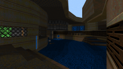
I didn’t have much time left when I made my third map, Swirlytron (2 bottom-left screenshots), so I ended up making a flawed layout that wasn’t equilateral in 3 directions. The whole map was kind of a joke, but it was a concept that I had in my head right after finishing the first map, and I was compelled to make it. The idea was similar to Yoo Hoo Wrecking Crew in that the bases would be very close to each other but would require round-about routes to gain flag access. However the gimmick here was that the route would be a super-fast flowing river that encircles the entire map, flowing in one direction. Each base would have a “stop” on the flowing river which would provide access behind the bases. Bases also had defensive walls that could raised by attackers so the flag could be more easily grabbed. The original, flawed map was no more complex than that. But because it was technically an illegal map, so I ended up remaking the entire thing from scratch during the detailing phase. Honestly the reason why the original layout wasn’t congruent to begin with was because the structures were a nightmare to mesh together. This was more of a singular structure that had to fit together instead of 3 bases butted up against a mid-section. On top of that, the flowing river needed to flow along its containing walls in a perpendicular manner, and these walls were at strange angles (the angles of the walls are important when you setup the moving floors). The defensive walls also weren’t implemented very well, so I remade them. I ended up expanding the layout with an outer wall that could be traversed, and made a more involved mid with blocking walls separating the flag stands that met at a central platform; this platform provided access to all of the bases through a small opening and also provided a rocket launcher. It’s a silly and dumb map that took more effort to make then the other two by a wide margin 
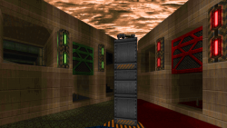
The last map, Crux of Captivity (2 bottom-right screenshots), was a map by Marcaek. He wanted me to detail it, so I gave it a shot. The nice thing about detailing a map like this is that you don’t have to try and figure out all of the 3-way mirroring stuff, its already done for you. All I had to do was split it up, detail a single base, duplicate it 2 times, merge them together, and then swap out the base colors. It’s a cool map and I think the detailing work came out pretty good considering I did it within the span of a night.
Last but not least on the mapping front is my submission to Eviternity – Gossamer.
Those of you who read my previous post already know about this map’s more vanilla incarnation. It was originally a submission for Vargskelethor’s 2nd Doom mapping contest. Since then, Joel has already played the map on stream and the contest is over. I was also still in the process of converting the map over for Eviternity, and the project hadn’t been finished yet. So while I could have posted in-progress shots, I felt it would have been better to wait until the map was totally finished. So you’re getting those screenshots now!
I love how the map was transformed in ukiro’s texture set, and the additions and tweaks make it a more enjoyable experience over the version Joel played. The original map killed my motivation for a while because I [stupidly] crunched hard to finish it in a week. Ignoring that though, I’m happy with how the map turned out. There’s more information on the project page as well as a link to the original version of the map, so go check that out if you’re interested.
For the mappers and modders out there who come by and read my ramblings, I made a huge update to my Mek’s Box ‘O Skies resource. I’m up to version 3 with a total of 562 (407 of which are in this update alone). One day I got an itch to make a bunch of skies from ideas that I had floating around, and it got a bit out of hand. This pack will probably get another update in the future, whenever I get that itch again 
And that’s it for this year! We’ll see if I’m able to make more than 1 post a year from now on…I’m not holding my breath though, heh. I want to get some more Supplice stuff out there so I’m gonna try really hard and do that. If some good progress gets made in the coming months, I’ll see about making some meaningful update posts here. Until then though, take care and thanks for stopping by!



William Huber
27 Oct 2019Thanks for your dedication to this old game, Mech. Your work is definitely incredible and a huge source of inspiration for us mappers.
Mechadon
31 Oct 2019I really appreciate your kind words William! Thanks for stopping by![:]](https://mekworx.the-powerhouse.net/wp-includes/images/smilies/emot-smile.gif)
Jason Dagenet
17 Dec 2019Would really love to see a video of you creative process throughout your mapping. How you plan layouts, architecture/detail, etc. Your work is phenomenal. Looking forward to your future releases!
Mechadon
17 Dec 2019I’ve thought about doing a stream, but at the moment my internet connection wouldn’t really allow it. So maybe I’ll do another recording somewhere down the line (I did one for Vela Pax years ago, but it just showed a slice of detailing work).
Thanks for the kind words Jason, and thanks for stopping by!